In this post I have included photographs of my initial mock-ups for one of my final designs.
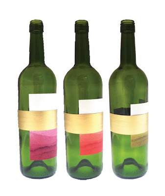
First off I experimented with how long the wine label should be. From left to right the labels are 12cm, 10cm and 8cm high. From photographing these labels I have decided the first one has the most colour on it, however I can still get rid of more colour. So, the final label size is going to probably end up around 11cm cutting off the white at the top.
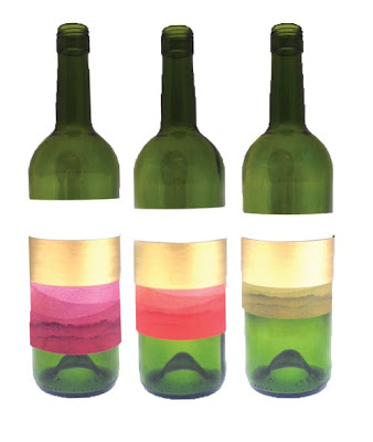
Side view of the height experiment.
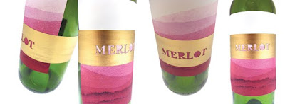
After deciding the height I then wanted to work out where the gold band should sit. The left bottle shows the band near the top, this was to stop the colour from going in the upper half of the label. However, I thought it was too hard to read the writing as the colour is paler as you go higher. Therefore, I moved the gold band down (right image), and the title is much clearer. I also think there is a better balance when the band is sat lower.
Unsure about the gold band around the neck. Don't know whether it makes the piece look more uppercase or not.
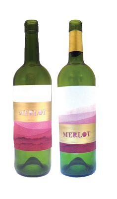
Side view of the bands at different heights.
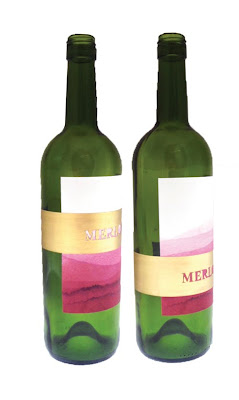
More images of the two versions to compare. For me the lower band definitely stands out more.
I have also decided to try and include the Napa Valley brand at the top of the label as there is room when the band is low. I may gold foil this to make it more subtle.


 Side view of the height experiment.
 After deciding the height I then wanted to work out where the gold band should sit. The left bottle shows the band near the top, this was to stop the colour from going in the upper half of the label. However, I thought it was too hard to read the writing as the colour is paler as you go higher. Therefore, I moved the gold band down (right image), and the title is much clearer. I also think there is a better balance when the band is sat lower.
 Side view of the bands at different heights.
 More images of the two versions to compare. For me the lower band definitely stands out more.
 I have also decided to try and include the Napa Valley brand at the top of the label as there is room when the band is low. I may gold foil this to make it more subtle.


