
Porfolio, version 3
16 years ago


 Cola bottles:

 Banana foams:

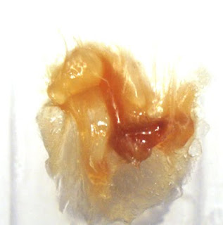
 Laces:

 Teeth and lips:

 White chocolate buttons:


 White Chocolate Buttons:


 Coca Bottle:
 Jelly Beans:
 Strawberry Lace:
 White Chocolate Button:
 Teeth and Lips:


 The istock photo seen is only $10 or something cheap so if the client is happy with this then I shall go ahead and purchase it. I am pleased with the contents page, however I feel the margin in between the two columns of text needs to be larger. I shall see how it prints out before I decide what to do.
 I want to use images as much as possible as I feel this will be more appealing to the target audience, but I do require the space for body copy, therefore I need to find a way of having both on the same page. This is what I have come up with at the moment, however, I am unsure how strong it is, and whether it is just distracting and does not flow with the rest of the grids.
 Where I have been limited to no images I have attempted to use colour to draw interest instead. I want to print this out so I can see how the 10pt size works in white on turquoise. I also need to develop the map page for two main reasons. One, I am unsure what the actual map is going to look like, therefore it is hard to judge the layout and two, I think it is too empty at the moment, however I cannot put type over the map like on the first page, as the map is a vital part of the information given.
 Pleased with the griding, however, it looks very bland and is not very appealing to read. I have screenshots of the website I can include, however the scale of them is wrong and I think it could look too busy. Maybe I should add another stock photo?
 Again, trying to use the reversed colours to create more interest and I actually feel like it works, however I need to talk to the client about images - see whether he is happy with this or as I feel, it needs more images and interest.
 Final page is unfinished as I have not got the details of the sponsors/contacts yet. However the grid is ready to go! and this final page will look similar to everything else I have done.