Thursday, 17 December 2009

Module Evaluation

At the start of this module my rationale stated that I wanted to focus on brand identity; branding with packaging; page layout and packaging. Therefore I selected briefs that I thought would help me develop the correct skills for these areas. Looking back, I believe most of the briefs I selected were right for me and have helped me grow as a designer, however, there were 2 briefs, the wagamama and festive briefs, that did not aid my development. I did not gain anything from doing them and I now think they were a waste of my time - I could of selected another branding and packaging brief that would have helped me more. But, I should say that doing those two briefs has made me clarify the areas I want to be focussing on for FMP. It has also taught me that I need to spend more tyime over Christmas researching briefs and selecting ideas that will allow me to get the most out of them and prepare me for the real world.
This module has allowed me to develop an understanding of what design I am excited by and want to be producing. I believe it has allowed me to clarify that packaging is my main area of interest, with branding being a close second. The page layout brief I produced showed me that grids are important and relevant but that I am not that interested in them. I would still like to have a general understanding of how to produce a booklet as this would be another element I could use in my work, but it is not my passion.
Receiving feedback on my work throughtout this module has been critical to my works development as well as my own. I hope to take advantage of this in my FMP by having crits with the peers around me and asking for opinions. I should definitely be making the most of this element whilst I can.
Technically I have learnt more about print processes, paper stocks, and colour palettes. All these skills are vital to me developing into a better designer and I feel this module has allowed me the chance to try new methods and processes, such as foiling, screenprinting and vinyl cutting.
Organisation has been another key part of this module for me. I always say I am an organised person but I believe I actually put this into practice for this module. I was well prepared for tutorials, crits and the deadline. But more importantly I was able to get more from my time. This is especially true for the run up to the deadline and it is something I want to keep going when I return after Christmas.
Looking forward I want to start looking for briefs straight away as I do not want to waste my time on briefs that I am not gaining anything from (festive brief). I know the area I want to focus on, packaging, but perhaps I should be investigating what elements, such as branding, can work with this as I want to make my portfolio and myself more of a 'package'. I also want to keep my motivation and learning from this module going over Christmas and into my FMP.

Tuesday, 8 December 2009

some photos of final sucka4sweets.com packaging...

I am really pleased with the final outcomes for the packaging. I know the branding could still be improved but the bags are really successful, in my eyes!


Sunday, 6 December 2009

final napa valley labels...

Below are my final pieces for my napa valley brief. I am pleased with the outcomes. However, now i have put them into context there are a few things I would like to develop and change. I shall talk about those in my context blog post thought.

Friday, 27 November 2009

remember me?

I want to send a christmas card to FLB (where I had my summer internship) so I thought I would use their logo in my design. Below are two testers I have done to try and decide which to use. I prefer the plain christmas pud, but think using the logo is a clever little twist. I also think the white writing works better.
Left design it is?

Wednesday, 25 November 2009

mock-ups

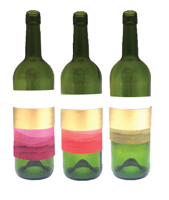
In this post I have included photographs of my initial mock-ups for one of my final designs.
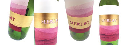
First off I experimented with how long the wine label should be. From left to right the labels are 12cm, 10cm and 8cm high. From photographing these labels I have decided the first one has the most colour on it, however I can still get rid of more colour. So, the final label size is going to probably end up around 11cm cutting off the white at the top.
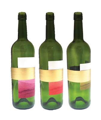
Side view of the height experiment.
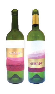
After deciding the height I then wanted to work out where the gold band should sit. The left bottle shows the band near the top, this was to stop the colour from going in the upper half of the label. However, I thought it was too hard to read the writing as the colour is paler as you go higher. Therefore, I moved the gold band down (right image), and the title is much clearer. I also think there is a better balance when the band is sat lower.

Unsure about the gold band around the neck. Don't know whether it makes the piece look more uppercase or not.
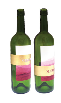
Side view of the bands at different heights.
More images of the two versions to compare. For me the lower band definitely stands out more.

I have also decided to try and include the Napa Valley brand at the top of the label as there is room when the band is low. I may gold foil this to make it more subtle.

Monday, 23 November 2009

after initial research...

After brainstorming a number of initial ideas I have now selected a few I want to develop. Below is an alphabet I have created using stencils and wine. I am pleased with the overall look and feel it is interesting and appropriate.


I developed the initial stencils on photoshop and below is the final alphabet.

Monday, 2 November 2009

branding development...

Over the last week I have developing my branding for sucka4sweets.com

Before is where I am up to now. I have used a bold font along with vibrant, striking colours for impact. I am quite pleased with the branding at the moment, however, I think it still needs a bit of developing.
For the packaging of the sweets the branding is going to be on a long band as I want it to cover the top of the bag to protect the sweets from falling out. Below are the 4 final colour ways I am picking from.

Next two images show variates of my label design for the sweet packaging.


Initial colour way research....

Wednesday, 21 October 2009

initial mock-ups for sweet brief...

Here is a shot of all the mock-up pieces together; they look like quite a strong set together. Will be interested to see how a label will work with them.

initial mock-ups for sweet brief...

Below are my initial mock-ups for the sucka4sweets.com brief. I am really pleased with the outcome of these designs, however, I am unsure whether or not this net is right for the purpose it serves. I know this is a bit backwards but I now intend to look at other nets to see if the is a better one for my brief.

Jelly beans:


Cola bottles:


Banana foams:


Laces:


Teeth and lips:


White chocolate buttons:


Monday, 19 October 2009

photographing my sweets...

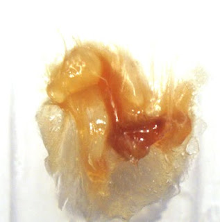
Before I started experimenting with the sweets I took close-up photographs of them in groups. This is for one idea I had where the wrapping/packaging of each type of sweet is produced from photography of them close-up. In other words where the pattern is so abstract it is hard to work out the object.

I feel this could work as the vivid colours would shine through and the pattern could be interesting and eye-catching.

Banana Foams:
White Chocolate Buttons:

Cola Bottles:

Jelly Beans:
Strawberry Laces:
Teeth and Lips:

melting my sweets..

As I am now trying to have more fun with this project (the content requires this of me) I have been experimenting over the weekend with my 'tester' sweets and below are the results of my melting experiment....
(I should say my first attempt to melt the sweets resulted in the house alarm going off as the the laces caught fire!!!)

Banana Foam (5 sweets):

Cola Bottles (5 sweets):

White Chocolate Button (5 sweets):

Jelly Beans (5 sweets):

Strawberry Lace (5 sweets):

Teeth and Lips (5 sweets):